Best WordPress Responsive Blog Themes 2022
Released - September 1st, 2022
In this post, we are going to evaluate the 10 best WordPress responsive blog themes that are extremely popular among bloggers in 2022. The themes offer all the modern, trending features for blog and publishing websites. The responsive WordPress themes are also SEO-friendly, browser compatible, and highly extendable.
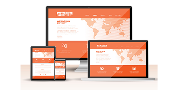
A modern blog website should be responsive to various devices such as smartphones, tablets, desktops, laptops, and macbooks to ensure maximum usability. A WordPress theme that makes the website respond for these various size screens is known as a responsive WordPress theme. The WordPress website developed with a responsive theme is considerably more user-friendly than a non-responsive theme.
So, how do the themes respond to these devices actually? To respond here means the website elements and contents scale down to smaller screens and scale up to larger screens in the most appropriate proportion, so as to ensure adequate space for accessing, sliding and tapping objects without having to scroll horizontally. That’s how the contents of a responsive website adapt automatically to fit various screen size devices only to ensure the maximum user-experience in terms of navigation and accessibility.
A responsive WordPress blog website prevents its elements from being larger than the width of the screen they are displayed on. Consequently, users do not have to unnecessarily scroll, zoom, or resize while going through the different elements of a webpage. A responsive WordPress theme saves you from creating multiple versions of your website for cross-devices; rather, it makes the website appear on various screens with corresponding layouts designed for them. That is why WordPress responsive blog themes are crucially important.
The following are the collection of the 10 best WordPress responsive blog themes used in 2022 that have been selected according to their popularity as well as the features and functionalities they offer.
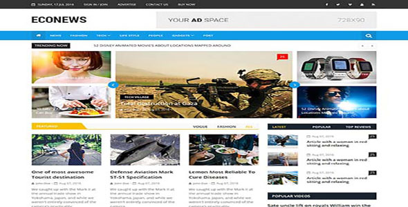
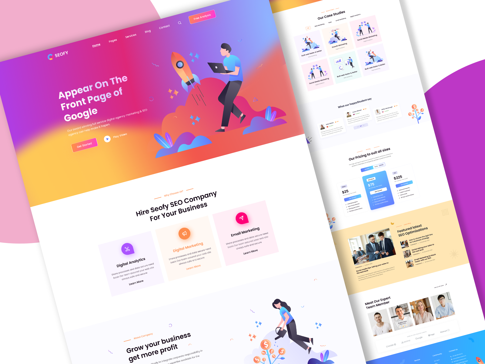
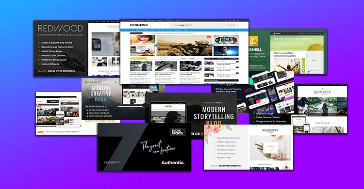
EcoNews is a premium quality free responsive WordPress theme crafted with the best blog, news, magazine, and other publishing features out there. The free responsive blog theme comes with numerous convincing features including Integrated Slider, Wide Blocks, Right Sidebar, Full-width Template, Flexible Header, Custom Colors, Custom Menu, Custom Logo, Custom Header, Custom Background, Integrated Video, Featured Image Slider, Post Formats, Sticky Posts, CSS Effect, Footer Widgets, Integrated Social Media, Theme Options, RTL Language Support, Translation Ready, and Google Fonts etc. The theme is highly extendable i.e. the features and functionalities can be customized to a large extent to best suit the purpose of a publishing website. However, the theme elements and contents are optimized for search engines and compatible with the popular web browsers. The retina-ready EcoNews – Responsive WordPress Blog Newspaper & Magazine Theme appears perfectly on the various size screens such as those of smartphones, tablets, PCs, laptops, macbooks, and netbooks etc. With these diverse featres and functionalities EcoNews stands out to be one of the best WordPress responsive blog themes out therre.
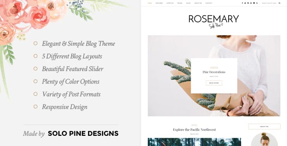
Rosemary is one of the best WordPress responsive blog themes to develop a website for food, fashion, beauty, health, lifestyle, sports, entertainment, or other types of blog contents. Designed in lightweight, clean, elegant templates, the Rosemary theme offers all the modern, trending features and functionalities to incorporate into a WordPress blog website. The responsive blog theme is blessed with numerous stunning features including Gutenberg Support, Beautiful Featured Slider, Promo Boxes, 5 Different Blog Layouts (Classic, Grid, Grid with 1st Full Post, List, and List with 1st Full Content), Post Index Shortcode, Post Formats (Standard, Video, Gallery, and Music), Latest Post, Hide/Show Elements, Theme Options, Sticky Navigation, Color Options, Full Width Page Templates, Social Widget, Facebook Widget, Instagram Widget, About Me Widget, Social Icons Integrated Header, Instagram Feed Footer, Contact Form 7 Support, WooCommerce Support, and Translation Ready etc. The blog theme templates are compatible with Retina Screens and fits perfectly on various devices such as smartphones, netbooks, laptops, macbooks, as well as on desktops. The Rosemary WordPress blog theme contents and elements are optimized for search engines and compatible with the popular web browsers as well.
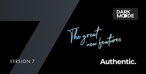
Authentic is a responsive WordPress blog theme crafted exclusively with lifestyle blog features and contents in mind; though, other types of blog websites can also be built with the theme. The Authentic theme comes with several lucrative features to introduce in your blog website in the most comprehensive manner. The convincing Authentic WordPress blog theme features include Homepage Sliders (Center, large, Wide, Multiple, and Boxed Slider), Parallax and Video Backgrounds, Posts Widgets (Slider, List, and Numbered), Multiple Layouts, Page & Post Featured Images ( Default Header and Standard, Large, and Wide Headers with Parallax Effect), Text Formatting (Drop Caps, Lead-ins, and Paragraph Containers), Post Galleries (Standard Slider, Large Slider, Standard Justified, Standard Grid, and Large Justified), Sticky Elements (Header Navigation, Sidebar, and Share Buttons), WPML and Translation Ready, Dynamic Footer Builder, Retina Ready UI Elements, Included Child Theme, One-click Demo, Integrated Social Media (Twitter, Instagram, and Facebook feeds, buttons, links, and other credentials), Integrated Pinterest Pin, Embedded Videos, Light Box Image Zoom, Paginated Posts, Footer Widgets, Custom Search, Lazy Load Effect, MailChimp Support, and Google Fonts etc. Built in Twitter Bootstrap, the WordPress blog theme also comes integrated with several powerful plugins like Canvas, PowerKit, Advanced Popups, Absolute Reviews, and WooCommerce. The Authentic layouts and contents are Retina-ready and therefore responsive to different screen sizes of smartphones, desktops, and laptops etc. The theme contents are also highly extendible so as to allow further customization to best meet the purpose of a blog website. The SEO-friendly Authentic WordPress responsive blog theme contents are also browser-ready. The theme poses to be one of the best WordPress responsive blog themes for its diverse features and functionalities.
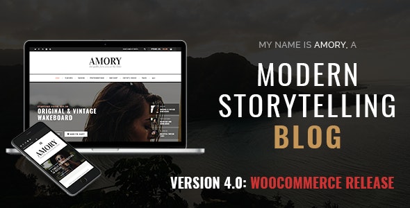
Amory is a clean, elegant and one of the best WordPress responsive blog themes out there to create a comprehensive fashion, creative, or photography website. All the modern, striking blog features have been introduced in Amory to conveniently create an ideal website for bloggers, as well as for businesses, agencies, and other services. The convincing Amory features include Integrated Revolution Slider, Unlimited Colors, Multiple Layouts, Full Width and Fixed With Pages, Full Width and Sidebar Pages With Slideshow, Shortcodes, Boxed Version, Upper Block on Homepage, About Us Block, Quote Block, Instagram Block, Embedded Videos, Facebook Integration, Instagram Feed, Social Integration, Gallery Posts, Email Subscription, Dedicated Ad Blocks, Smooth Scroll, Audio and Video Posts, and WooCommerce-ready etc. Amory WordPress Blog Theme is designed responsive to retina screens, so the contents scale seamlessly to fit all the popular viewing devices such as smartphones, desktops, laptops, and macbooks etc. The theme is also compatible with the cross browsers. The Amory responsive blog theme contents and elements are highly optimized for search engines as well. However, the Amory features are extensible to best meet the requirements of a WordPress blog website.
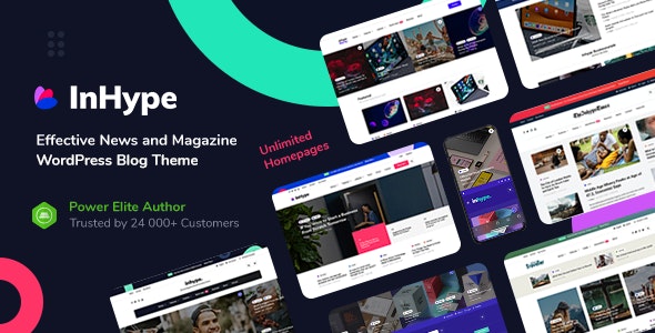
InHype is a clean, elegant, modern, and dynamically responsive blog theme designed exclusively for WordPress blog and magazine websites. The theme offers all the essential features for the development of a most engaging blog or magazine website in the best possible way to ensure the maximum conversion. The powerful InHype theme features include Unique Drag and Drop Homepage Builder with Live Preview in WordPress Customizer, Gutenberg Support, 38 Homepage Blocks, Blocks Repeat on Homepage and Other Pages, Grouped Posts, 11 Blog Listing Layouts, 20+ Single Post Page Header Variations, Load More Feature for Homepage Blocks and Blog Listing, Post Preview and Rating, Integrated WooCommerce, User Registration and Login, Integrated Social Sign-up and Sign-in, Multi-authors Support, Static Homepage with Theme Blocks, Blog Homepage Support, Advanced Mega Menu, 10 Predefined Color Skins, Dark Theme Variant, Unlimited Blog Style Variations, Unlimited Blog Layout Variations, Post Formats, Worth Reading Posts Block, Reading Progress Bar, Related Posts, 5 Widget Sidebar Areas. Custom Theme Widgets, Different Header Styles, Sticky Header, Transparent Post/Page Image Header, Featured Post Header Slider, Different Footer Styles and Layouts, Footer Shortcode Block, Footer HTML Block with Image Animations, Scroll Animations for Post Listing, Small Width Page/Post, Advanced Post Pagination,10 Theme Enhanced Plugins for Free, Built-in Advertising Management, JetPack Tiled Galleries, Integrated Instagram Feed, Integrated MailChimp Newsletter, Lightbox and Lightbox Galleries, Integrated Social Share and Social Follow, Google Web Fonts, WPML Support, Google AMP Support, and Integrated WooCommerce etc. The theme comes with the most required Responsive Design feature to ensure the maximum reach of audience for the blog website through different media for viewing content such as smartphones, tabs, laptops, and desktops etc. as well as for popular browsers such as Chrome, Firefox, IE, Opera, Edge, Safari, and Brave etc. The InHype theme contents are highly optimized for search engines. The WordPress responsive theme is also customizable to a great extent for expanding features and functionalities to suit your blogging purpose. InHype stands out to be one of the best WordPress responsive blog themes for these extensive features and functionalities.
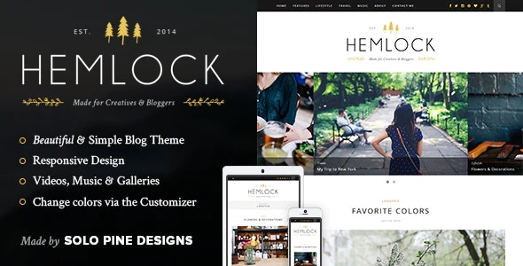
Hemlock is one of the best WordPress responsive blog themes offering convincing features for ideal one-column blogging websites. The Hemlock features include WooCommerce Ready, Gutenberg Ready, Full Width Blog, Full Width Featured Slider, Grid Block Layout, Sidebar Layout, Post Formats (Standard, Video, Gallery, and Music), Custom Facebook Widget, Custom Social Widget, Custom About Me Widget, Custom Latest Post, Custom Instagram Widget, Hide/Show Elements, Theme Options, Color Options, Support for Contact Form 7, Integrated Social Media in Header and Footer, and Translation Ready etc. The WordPress theme is also customizable to further extend the features and functionalities to best meet your blogging requirements. The search engine friendly elements and contents are compatible with the popular web browsers. The WordPress blog theme is ensured with the most crucial Responsive Design feature to make the website appear fit on several viewing devices with varied screen sizes such as smartphones, tablets, PCs, laptops, and macbooks etc.
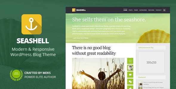
SeaShell is a clean, lightweight, and professional WordAPress responsive blog theme that offers numerous convincing features to create websites for blogging in the most convenient way. The striking SeaShell features include One-click Demo Import, Flexible Blog Layouts, Smart Categories, Quick Post Navigation, Post Formats (Video, Image, Audio, Quote, Gallery, and Links), Post Meta Data, Smart Categories, UI Branding Elements, Unlimited Sidebars, Built-in Theme Translator, Custom Widgets, FontAwesome, Integrated Social Networks, One-click Updates, Shortcodes, as well as Compatibility with JetPack, WooCommerce, Yoast, WPForms, Disqus, MailChimp and GDPR etc. The responsive blog website theme contents are flexible to customize to further extend the features and functionalities so as to personalize your blogging experience to a great extent. The SeaShell theme turns out to be one of the best WordPress responsive blog themes out there for the contents and elements are search engine friendly and compatible with the popular web browsers as well. The Retina-ready feature of SeaShell – Modern Responsive WordPress Blog Theme only ensures the compatibility of the theme layouts with the cross devices with various screen sizes.
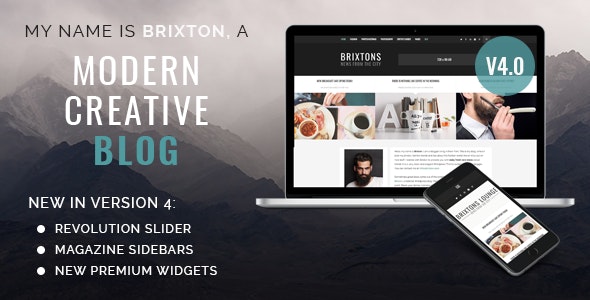
Brixton is one of the most popular clean, minimal WordPress responsive blog themes to create a website and take your blogging experience to another level. The responsive theme offers numerous trending publishing features to utilize in order to build comprehensive, intuitive, and sophisticated WordPress blog or magazine websites. The impressive Brixton features include Revolution Slider, Multiple Layouts, Full Width Blog, One-click Demo Import, 7 Post Templates, CSS 3 Animations and Effects, Unlimited Color Variations, Enhanced Readability, Creative Design, Search Bar, Slideshows, Sidebar Widgets, Sidebar Variations (Left Sidebar Under Header, Right Sidebar Under Header, Full-width Sidebar Under Header, Left Sidebar Above Footer, Right Sidebar Above Footer, Full-width Sidebar Above Footer), Social Integrations, Ad Banner, About Us Section, Standard Posts, Gallery Posts, Video Posts, Audio Posts, Link Posts, Fast Page Speed, Facebook Feed, Twitter Feed, Instagram Feed, and Google Fonts etc. The blog theme contents are highly optimized for search engines. The theme is considered to be one of the best WordPress responsive blog themes out there for the templates are also compatible with retina screens and responds to various size viewing devices such as smartphones, tablets, laptops, desktops, and macbooks etc. The responsive theme contents and elements are compatible with popular web browsers like Firefox, Safari, Chrome, Brave, Opera, Internet Explorer, and Edge etc. The Brixton WordPress blog theme can be further extended to add more features and functionalities to best meet the requirements of the blogging or publishing purpose.
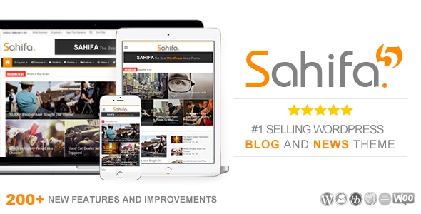
Sahifa is a powerful, creative, and elegant responsive theme that comes with lots of striking features to effectively incorporate into a WordPress blog, news, or magazine website. The convincing Sahifa features include Layout Variants (Wide, Boxed, and Framed), Mega Menu, Icons for Menu Items, Drag and Drop Homepage Builder, Powerful Admin Panel, Sticky Navigation Menu, Multiple Page Post Support, WordPress Multi-level Drop-down Menu, Sticky Sidebars, Shortcodes, Dark Skin Variation, Unlimited Sidebars, Localization Support, Social Media Users Profile Support, Built-in Translation Panel, Theia Sticky Sidebar Plugin (Worth $17), Taqyeem Buttons Addon (Worth $5), Taqyeem Predefined Criteria Addon (Worth $6), Taqyeem Plugin (Worth $15), iLightBox Plugin, Built-in Translation Panel, Built-in Related Posts, Pagination, Unlimited Colors, Post Views System, Flay-Check Also Box, Full-screen Background, Optional Breadcrumb Navigation, Ajax Live Search, Masonry Layout, OFF-canvas Mobile Navigation, 8 Theme Skins (Purple Red, Pink, Green, Blue, Black, and Yellow), Image Sliders, Page/Post Modules, Breaking News with Animation Effect, 10 Page Layouts, 6 Footer Layouts, 35 Custom Widgets, WPML Compatible, bbPress Compatible, Infinite Scroll Plugin Compatible, RTL Support, Integrated Schema, Built-in Review System, 46 Pre-defined Background Patterns, WooCommerce Ready, Twitter Feed Widget, Facebook Like Box, Flickr Feed Widget, Google+ Follow Box, Feed Burner Widget, Featured Video Widget, Social Counter, Review Widget, SoundCloud Widget, Social Icons Widget, Recent Comments Widget, Search Widget, Youtube Subscription Widget, and Advertisement Widgets etc. However, the WordPress blog theme is crafted with the most required Responsive Design in mind to ensure the maximum reach of the website via different media such as desktops, laptops, smartphones, macbooks, tablets, and netbooks etc. The Sahifa blog elements are also SEO-friendly and compatible with the popular web browsers. The responsive blog theme is highly extendable as well. Sahifa stands out to be one of the best WordPress responsive blog themes out there for these extensive features and functionalities.

Redwood is a clean, elegant, and creative responsive theme with aesthetic features for WordPress blog websites. The WordPress blog theme features include Gutenberg Support, Featured Slider, Promo Boxes, Full-width Narrow Post Layout, 5 Different Blog Layouts (Classic, Grid, First Full Post Then Grid, List, and First Full Post Then List), Post Formats (Standard, Video, Gallery, and Music), Full-width Instagram Feed in Footer, Customized MailChimp, Custom Social Widget, Custom Instagram Widget, Custom Facebook Widget, Custom About Me Widget, Custom Latest Post, Contact Form 7 Support, Sticky Navigation, Theme Options, Hide/Show Elements, Unlimited Colors, Full-width Page Template, Full-width Page Template with Slider and Promo Boxes, Social Media Icons Drop-down Support, Translation-ready, and WordPress.org Compatibility etc. The theme is one of the best WordPress responsive blog themes as the templates are designed Responsive for retina screens for the perfect appearance of the blog posts in various viewing devices such as smartphones, tablets, netbooks, laptops, desktops, notebooks, and macbooks etc. The responsive blog theme features and functions are highly extensible and can be customized so as to personalize the blogging experience to a great extent. The Redwood responsive blog theme elements are SEO-friendly and compatible with popular web browsers as well.
So, these are the 10 best WordPress responsive blog themes from which you can select the most p[erfect one for your website to take your blogging experience to another level.